.jpg)
Mobile-First Design: Creating Interfaces Tailored for Small Screens
<p>Introduction:</p>
<p>In an era where mobile devices dominate internet usage, adopting a mobile-first design approach has become a necessity for businesses. At Arema Technologies, we understand the importance of creating interfaces that are tailored for small screens. If you're seeking expert guidance or need tailored mobile-first design solutions, contact us at +91 9457169257 or email us at <a href="mailto:info@arema.co.in" target="_new">info@arema.co.in</a>. In this blog post, we'll delve into the concept of mobile-first design, why it matters, and how it can enhance user experiences.</p>
<p>**1. <strong><em>What is Mobile-First Design?</em></strong></p>
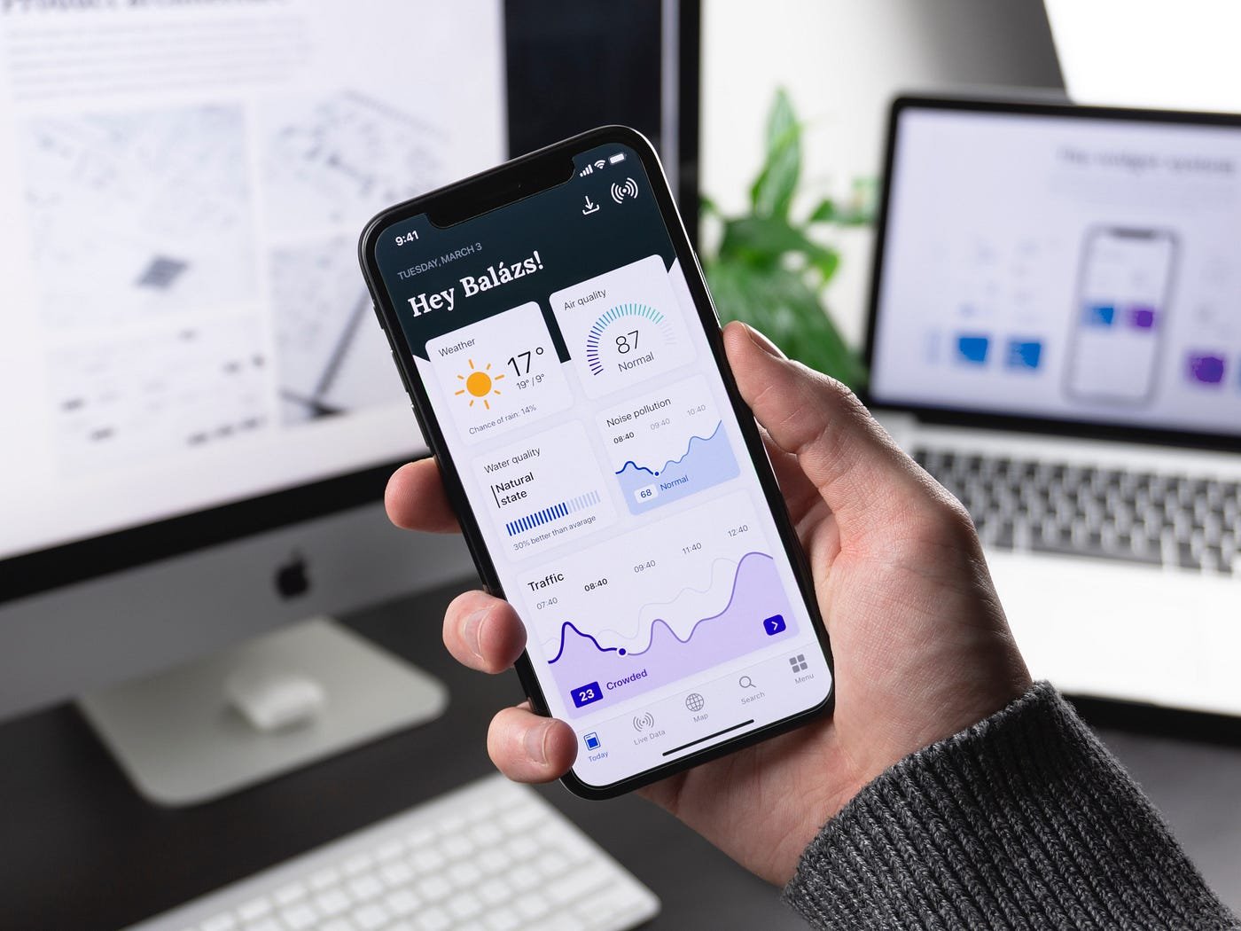
<p>Mobile-first design is an approach that prioritizes designing for mobile devices before scaling up to larger screens like desktops or tablets. It ensures that the user experience is optimal on small screens and progressively enhances as screen size increases.</p>
<p>**2. <strong><em>Why Mobile-First Design Matters:</em></strong></p>
<p>a. <strong><em>Mobile Traffic Dominance:</em></strong> With more users accessing websites and apps via mobile devices, designing for mobile ensures you cater to the majority of your audience.</p>
<p>b. <strong><em>Improved User Experience:</em></strong> Mobile-first design focuses on simplicity and efficiency, resulting in more user-friendly interfaces.</p>
<p>c. <strong><em>Faster Page Load Times:</em></strong> Mobile-optimized websites tend to load faster, reducing bounce rates and improving SEO rankings.</p>
<p>d. <strong><em>Scalability:</em></strong> Starting with a mobile-first approach makes it easier to adapt and scale up to larger screens without compromising user experience.</p>
<p>**3. <strong><em>Key Principles of Mobile-First Design:</em></strong></p>
<p>a. <strong><em>Simplified Navigation:</em></strong> Prioritize essential content and navigation options, eliminating clutter on smaller screens.</p>
<p>b. <strong><em>Responsive Layouts:</em></strong> Use responsive design techniques to ensure that content adapts seamlessly to various screen sizes.</p>
<p>c. <strong><em>Touch-Friendly Elements:</em></strong> Design buttons, links, and interactive elements with touch in mind to accommodate touchscreen interactions.</p>
<p>d. <strong><em>Content Prioritization:</em></strong> Decide what content is most important and ensure it's prominently displayed on mobile interfaces.</p>
<p>e. <strong><em>Performance Optimization:</em></strong> Optimize images and scripts to reduce page load times on mobile devices.</p>
<p>**4. <strong><em>Case Study: Airbnb:</em></strong></p>
<p>Airbnb's mobile app offers a seamless booking experience on smartphones, making it easy for users to find accommodations on the go.</p>
<p>**5. <strong><em>Case Study: Google Search:</em></strong></p>
<p>Google's mobile search interface is clean, efficient, and responsive, catering to users searching for information on their smartphones.</p>
<p><strong>Conclusion:</strong></p>
<p>Mobile-first design is no longer an option but a necessity for businesses looking to provide exceptional user experiences and stay competitive in a mobile-centric world. By prioritizing small screens, you can create interfaces that are efficient, user-friendly, and adaptable across a range of devices.</p>
<p>At Arema Technologies, we specialize in mobile-first design solutions tailored to your business needs. If you're ready to enhance your mobile interfaces or need expert guidance, contact us today at +91 9457169257 or email us at <a href="mailto:info@arema.co.in" target="_new">info@arema.co.in</a>. We're here to help you create interfaces that resonate with your mobile audience.</p>
About us

Banner ad

.png)